Verizon
Consumer product design
Verizon Wireless is the largest telecommunications provider in the United States. I was staggered at first at the scale of the company’s reach, providing 98% wireless network coverage in the US that serves millions of customers. All of whom can use My Verizon online and on the app to manage their phone plan, pay their bills and get answers to questions.
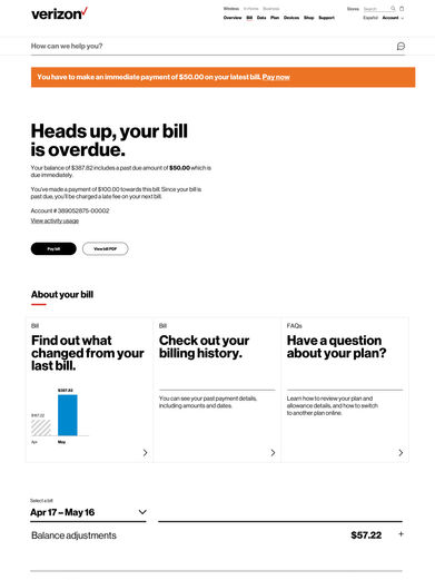
I joined the project at the end of the discovery phase, which provided ample evidence through data and user research that the website needed a holistic transformation in order to meet the needs of customers who expected a superior experience from the premium network in town. I led the execution to flesh out and deliver all billing and payment user journeys which over 30 million customers experience every month.
This synopsis gives a high level overview of the work I've done which is now live. If you would like to find out more about my design process, get in touch and I would be happy to take you through a detailed case study of the end-to-end process.
Approach
The discovery phase had concepted a new framework for the bill, structuring it purposefully for the needs of multi-line accounts instead of the current single line focus since the average Verizon customer had one account for their whole family. Providing charge information line by line on the bill made it easier to work out how much each line owed including all the pesky surcharges and taxes.
My visual design partner and I were a very close team, getting to grips with the intricacies of Verizon’s billing system with the help of a copy writer, strategist, analyst and our project manager. At this point we started to focus our attention on understanding all formats the bill was currently available in - online, on the Verizon app, on the paper bill, point of sale systems and customer service tools. Each design used different language and messaging to convey the same information which added additional confusion to customers who used different touch points to view and pay their bill. I leveraged all existing user research I could find to evaluate pain points across each medium and used this data to weave together our presentations each week to stakeholders.

Design thinking
The cornerstone of all my design thinking came back to understanding the bill cycle. Since a bill is the definition of personalisation, we knew that to provide an equally personalised experience around it we needed to create an efficient way to serve all customers at any one time.
I thoroughly enjoyed working out how we could leverage the phases of the billing cycle to do this in a way that was transformative within the realms of feasibility given the legacy billing systems that constrained us. This system allowed us to create dynamic copy at every stage of the customer’s billing cycle to personalise content on a massive scale and encourage customers to self-serve billing queries they were likely to have at that phase. I saw first-hand in user testing every sprint how our new messaging resonated with Verizon customers, and worked through any feedback closely with my team to ensure the content reflected the concerns of users.
Impact
The new bill design went live to 100% of Verizon Wireless customers in November 2018. The reduction in billing related calls to the call centre until the end of 2018, led Verizon to believe that if the reduction was maintained through 2019 they would make millions of dollars of savings in call centre costs. This surpassed all expectations, and led to the creation of a new workstream that I pushed forward to spread our design thinking to the My Verizon App and paper bill.
Get in touch to take a peek at the full case study.


